What's in a Company's Logo?
In the past week, news broke out over DC Comics adopting a new logo again. It is definitely not the first time the company has made such a change, but what makes it so jarring is that this is the third logo DC has switched with within the past 10 years.

Amit Desai, DC Entertainment Senior Vice President of Marketing and Global Franchise Management stated: “The launch of the new logo is the perfect tribute to DC’s legacy, exciting future, and most importantly, our fans.”
And with that reasoning in mind, DC's logo moving backward in a retro appeal invoking the 1972 version is completely baffling. Since most comic fans still consider the "DC Bullet" from 1976 the best-looking design. Why not use it again or have something similar? Even when I was buying DC comics as a kid, I always thought how the bold text within the circle made it looks very official like a Presidential seal, and how the 4 stars made it feel all American!
So of course many on the internet reacted negatively towards the change, seeing it as nothing more than a desperate and needless act to save the company. It is no real secret that DC comic sales have always been behind Marvel, and not to mention currently losing out to them in the cinemas as well.
But can changing a company's logo actually help boost sales and interest? Is a logo really that important? The answer is YES (to a good extent)! But a logo has to be more than just a pretty image. It has to represent your company's "business identity".
Let us take a look at Marvel Logo evolution for comparison sake:
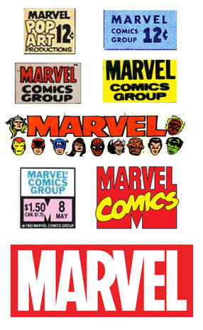
Marvel Comics logo seems to have gone through an equal number of drastic changes, but the overall concept stayed about the same - the MARVEL text framed within a rectangular shape and often accompanied by red colors.
For many decades it clearly spelled out what it is... AN EXCITING COMIC BOOK COMPANY.
Interestingly enough, Marvel in recent years has dropped the word "COMICS" from its logo in favor of a more blanket corporate identity to encompass its rapidly growing movie division and multi-media aspect. It is a logical move because comic books are no longer the primary products associated with the company, so the change occurred in order to broaden its appeal to the mainstream public. It is definitely a smart direction for the company to rebrand itself this way as it continues to move forward with a recognizable design visual.
There are definitely many aspects to be considered such as colors, ascetics, or meaning when designing a company logo, but the most important point is how the logo must correctly represent what type of business it is associated with. Your company logo has to inform the viewer of what your company is all about in a single glance. That is the mindset I frequently find missing in a lot of small companies' logos. They either copy something famous or just go with a trendy "cool look".
Excel Comics went through numerous drafts during its logo design phase. We hired an experienced commercial logo designer for the job and here was the first batch of concepts he turned in:
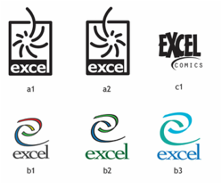
All of the designs on the left were rejected because they don't immediately give off the sense that the business is primarily a comic book company. These were deemed too soft, too abstract, or too relaxed, or even too pretty to say "COMIC BOOKS".
I ran these by Hector Collazo at the time and his comments were: "A comic company logo needs to be bold and powerful! Tell the designer to go for things along the line of cereal boxes and cleaning products!"
And Hector was right because here's what we got back as the second batch of designs:
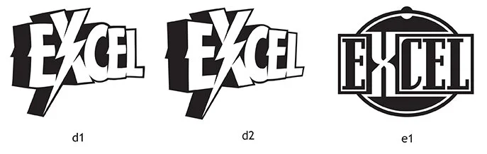
We liked (d2) and felt the lightning bolt makes an exciting statement, but it still needs some more refinery and must incorporate the word COMICS as part of the design. So the designer went back to the drawing board came back again with these:

Hector and I both thought (e2) was clean, simple, and straight to the point. So after some final adjustments, we, at last, had our very proud comic company logo!

Marvel is Red, DC is Blue... so we chose the last remaining primary color Yellow to stand in contrast. And perhaps if give enough effort and time and luck, we can also drop the word COMICS and move ahead towards an even bigger future!
Chi Wang